Friday 30 September 2011

Design Brief


A design brief is used to help identify the customers requests in a structured way. It helps the person reviewing the brief understand what the customer wants and doesn't want. Doing this will enhance the overall timescale of the project because everything is in order and will make more sense. It will  identify any constraints, the colour schemes, so the designer doesn't have to find previous emails, chase up telephone conversations, etc. A design brief will also be beneficial because if one designer doesn't complete the job and goes off ill, another designer can pick it back up from where you left off. 

Key Terms Used in Design:

JPEG - A JPEG is an image format. 
PDF - stands for portable document format and is used to represent a document in a manner that everyone can view it. 
EPS - an EPS is an image typically used to send to print as they're in vectors. EPS' are used in Adobe Illustrator. 
A4 - A4 is a standard paper sized used in the UK
PSD- A Photoshop document — an Adobe extension
CMYK - Process colour: cyan magenta yellow and key (black) - used in print
RGB - process colour: red, green, blue - typically used in web 

Thursday 29 September 2011

Curtains by Design


With this ad the customer supplied the text and images. I chose the purple/ lime green colour scheme from the pictures and I thought it would be a good contrast. I used a sticker effect to make the 10% offer more noticeable and jump out to the reader. I used a swirl effect at the top of the ad so the top wasn't too empty and dull. I used InDesign to create this and Photoshop to convert the images to CMYK.

From Painting to Papering


Before


After 

With this ad the customer provided the text and they said to use an image of various colour of paint and brushes so I used this iStock image. I used a gradient effect to blend it out naturally, descending into the blue. I put an outer glow on the title so the words didn't get 'lost' in the image and stands out.

Banbury Aerial and Telephone Services


With this ad the customer provided the text and another ad that someone else had created which they didn't like. I used the blue from their logo throughout so it looks complete. I used a sticker effect graphic to emphasise the 15% discount. I created this ad using InDesign.

Friday 16 September 2011

The Milestone Hotel


With this ad the customer provided the text and got asked to make it look "Christmassy". I got the picture of the woman with the chandelier off the clients website. I also used clip art snowflakes and a bold handwritten font for the heading 'Christmas'. The reason behind the red colour scheme is red is a common Christmas colour.


With this ad, the customer didn't like the red so I got a traditional Christmas image off the Internet and incorporated the gold from that into the rest of the ad. I created both of these ads in InDesign and used Photoshop to convert them to CMYK.

Smile Essence

Dave The Magic 1


With this ad the customer provided the text and asked for a more colourful background; their old one was black. I brightened it up with cards in the the background which i tinted back so they aren't too much. I got the picture of him off his website and using the pen tool in InDesign I went round him and used a basic feather on him so the corners weren't as harsh. I used a white gradient box so the text is more obvious and it stands out more. I used InDesign to create this and Photoshop to convert the images to CMYK.

Tuesday 13 September 2011

Chez Patrick


For this ad the customer asked for the same colours as their website:


I used the same font that they used on their website so everything is consistent and will professional and complete. The customer also wanted the banner off their website on the ad. I used the banner and i used a gradient to get rid of the hard edges, so that it blended into the cream colour. I used InDesign to create this ad and Photoshop to convert the  the picture to CMYK.

Foubert's


With this ad the customer only supplied the text. Dean found the picture of the mic in the stock images we have, and he told me how to use it in the ad (fade it out at the bottom.) I researched the business and saw their shop window writing was a subtle brown colours which is the reason behind the colour scheme. Originally, the text was a dark brown and the customer asked for a more subtle colour; I asked Dean and he said to try a light grey colour. I designed this in InDesign.

First Choice Plastering


With this ad the customer wanted in grey scale so I was limited to what I could do. The customer Provided the text. I tried to make it simple but effective so I used a reflection technique on the title and an outer glow effect on the telephone number so it wasn't just standard, like the rest. I used solid black lines to section the add off so it was clear and obvious what it's about. I used InDesign to create this ad.

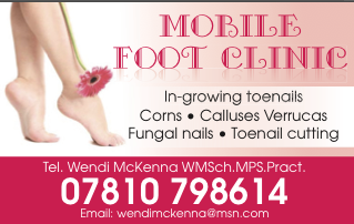
Mobile Foot Clinic


With this ad the customer provided text and asked for a picture of feet so I found this one and i took the pink from the flower and incorporated it throughout. I used a  white gradient in the centre so the text was clearer. I also used a reflection technique on the title so it stands out a bit more and it still fits in with the colour scheme. I used InDesign to design the ad and used Photoshop to convert the image to CMYK.

The Hampton Court Therapy Centre


With this ad I tried to create a tranquil setting with the turquoise colours and the tinted back whites. The customer asked for a countryside landscape in the background with trees in the foreground; I found it difficult to find an appropriate images I got two separate images. I used clip art trees for the foreground and blended them into the landscape. I put the photo at an angle and in a frame with a 3D page turn effect. I used a swirl at the top of the ad because I thought it looked empty and unfinished. I designed this in InDesign and used Photoshop to convert the RGB images to CMYK.

Bells Taxis


With this ad the customer provided the text and their logo, I used a red colour scheme as it was took out of their logo. I used a clip art aeroplane so it demonstrated what the company can offer effectively and simply. I made the number big so it stands out from the rest of the ad. I used InDesign to design this; with the clip art aeroplane it was originally black so I used Photoshop to make it white using the fill bucket tool.

Cinderella's Cleaning Services


With this ad the customer provided the text and said that they wanted a picture of a mop and bucket. Originally I used a consistent blue colour scheme but the customer replied and said they wanted the gradients the same colour as the broom (Orange). The font I used was based on Cinderella:


It's a classy and sophisticated font which will draw people in when they
 see it. I used a drop shadow effect on the image to make it more apparent and separate from the rest of the ad. I used InDesign to create this and Photoshop to convert the image to CMYK.

Cakes For all Occasions


With this ad the customer provided the text and a few images of cakes and I had to pick the one I thought was more effective. The customer asked for a lilac colour scheme which played a part in the choice of the cake because it has pink flowers which go well with the lilac. The cake picture was originally on a white background So I used the 'darken' tool in InDesign which then made the cake transparent and go purple, so I used the pen tool in InDesign to create a shape the same as the cake and filed in white, and placed it behind the cake so it got rid of the lilac and made the cake its normal colour. I placed a dark purple border around the ad to bring all the colours together. I designed this ad in InDesign and used Photoshop to convert the image to CMYK.

Ella Sheppard


With this ad the customer wanted a pink/ lilac colour scheme and they asked us to recreate their previous ad as they didn't like it. I decided the most important thing was the fact there's a new class starting, so I made that more obvious and stand out. I used a curved edge border as i thought it fitted in well with what the customer wants to put across. I used wavy lines because they're elegant and they are easy on the eye. I used InDesign to create this and used Photoshop to convert the picture to CMYK.

Imber Court


With this ad the customer provided the text and Dean found me the image for me to use. I used InDesign to create this. With the title text I wanted to use a font that was eye catching and something, which stood out as being 'Wedding related'. I found the border on the Internet and copied and pasted them and made them meet in the middle, I also tinted them back so they were easy on the eye and didn't draw attention away from the title. The customer asked for a lilac colour scheme so I stuck to that and introduced more bolder; prominent colours for the telephone number and the title. With the picture I had to use Photoshop to convert the image to CMYK; then I used an on the edges which took away the hard edges which I thought it gave a similar effect to confetti, which also fits in with the overall wedding ad.

TJ Bathrooms


With this ad the customer provided what text they wanted and what image, and the blue colour was used on a previous ad for them so I kept that the same for consistency. I used InDesign to create this ad and I had to use Photoshop to convert the bathroom image from RGB to CMYK colours. The left hand side looked a little empty so I used the pen tool in InDesign to create wavy lines; to get the waves neat I had to hold the shift key which kept the line straight as I made the 'curve'. And again, I used the blue so it remained consistent.