Copyright: The legislation that governs copyright is the Copyright, Designs and Patents Act 1988. Information about this can be found at http://www.ictl.org.uk/U5O3CG/page_12.htm. Copyright has an impact of design because everything designers use in their artwork may breach copyright, whether it be a logo or the shape of a sink. You have to be extremely careful when using imagery in particular because the image had to be taken by someone so you can't take their work and claim ownership of it; if they found out they could sue you/ your employer for using it. To avoid the majority of the copyright infringements stock sites are set up so you can buy professional, generic images safely and legally, a few of them include: iStock, Shutterstock and Getty Images. The images are usually reasonably priced, and if caught using someone else's image it'll be a lot cheaper for the foreseeable future.
Moral Rights: The legislation that governs moral rights is apart of the 'Copyright, Designs and Patents Act 1988'. Information about this can be found at: http://www.copyright.com.au/assets/documents/about-copyright/What%20are%20moral%20rights.pdf and http://www.ipo.gov.uk/types/copy/c-otherprotect/c-moralrights.htm. An example of moral rights would be using a web template and removing the designers name because it takes away the designers ownership so they don't get credited for their own work. The designer would want to be identified as the creator instead of someone taking responsibility from it. The designer is entitled to be the recognised author of the product, artwork, film, etc. Another thing moral rights protects is derogatory treatment towards the work or film otherwise it could be considered prejudicial towards the author.
Ethical Considerations: The legislation that governs ethical considerations is the Ethical Standards in Public Life etc. Act 2000. information can be found at: http://designproacademy.org/code-of-professional-conduct.html#. This act means that designers must treat all customers equally and fairly, not dependent of their race, gender, disability, sexual orientation, etc. It also means that they're required to provide a consistent level of quality in their work and not take advantage of the customer and always deliver top work at the same level as other designers. This legislation also states that the designer cannot engage in anything which can be considered illegal including fraud and breaching copyright. also, the legislation identifies that the designer should not catalog a clients' work without their consent.
Intellectual Property: The legislation that governs intellectual property is the Intellectual Property Protection Act of 2006. Information on this can be found at: http://www.ipo.gov.uk. Intellectual property helps people find the right protection for their creation and/ or invention. It also gives people the right to own their own work. There are four types of IP (intellectual property), these include: patents, trademarks, copyright and designs. If a car manufacturer designs a new car, they would have to protect it against being copied by another company, the designer/ company would have to get to right protection in order to prevent it. This is where all four types of IP would work together, for example, they would use patent so they could protect the way they make the car move (how the wheels works, steering, gears, etc.), they would trademark it to prevent the words/ any type associated with it couldn't be used, they would copyright it so people couldn't steal the overall idea and they'd protect the designs, so no-one copy their logo, appearance of the car, etc.
Sale of Goods: The legislation that governs sale of goods is the Sales of Goods Act 1979. Information on this can be found at: http://www.legislation.gov.uk/ukpga/1979/54. This act is to protect against people selling dodgy goods to others. This could affect design because if there was a product designer and he ordered some metals to create a prototype and the online product description said 'smooth, flexible metals that can withstand anything', and when the product designer received the metal a few days later and it's covered in shreds of metal and it snaps in his hands, it gives the designer the right to take it back and have some ground behind it. Without this people wouldn't be able to have their say and people could get away with selling faulty goods everywhere and no-one would trust what they bought online.
Employment: The legislation that governs employment is the Employment Act 2008. Information on the act can be found at: http://businesscasestudies.co.uk/business-theory/people/employment-legislation.html#axzz2JYCwIRs1. This act gives employees to have their own rights when in employment, it enables them to have time off for maternity/ paternity leave, get paid NMW (National Minimum Wage), not get sacked for silly reasons such as: gender, race, having a disability, etc. This act protects the employees against discrimination, being treated badly and being underpaid. Everything the act covers makes everything fair and determines that everyone is treated equally. This can affect designers because if they were about to have a baby and went on maternity leave their job would still be there for them when they were ready to go back to work, it gives them a sense of security instead of having to stress about becoming a parents and having to look for a new job.
Health & Safety: The legislation that governs health and safety is the Health and Safety at Work etc. Act 1974. Information on this can be found at: http://www.hse.gov.uk/legislation/hswa.htm. This act is to prevent work-related death, injury and ill health. It prevents people from working too many hours that they becomes over-tired and stressed. If a designer had to use a forklift in the warehouse and he wasn't trained and he crashed it and it ran him over, he would die, but with this act in place the designer can say he/she isn't trained to use it and therefore can refuse to do it, the employer cannot take any action on that because the designer is right. Designers are often required to deal with toner for printers which can be toxic if inhaled so the correct precautions have to be set: big aired room and don't inhale the toner.
Tuesday, 29 January 2013
Monday, 26 November 2012
The Design Industry
The design industry is a huge circle of companies that are all creative and innovative, they design everything from pens, windows, cars, cameras, etc. There are a number of different talents related to art and design. There are a number of different professions in the design industry, some being:
Graphic design
Art
Illustration
Fashion design
Furniture design, etc.
Although these are different fields of expertise it all involves the same thinking and structure — for example an artist uses paints, paper and drawing techniques; a fashion designer uses fabric, sewing machines and models but they both have to come up with an initial concept and plan what they're going to do when given a brief by a client.
The design industry relates with other industries, including:
Marketing
Printing
Health and beauty
Food and catering, etc.
They all require design in some way, whether it be packaging, flyers or branding. For example, the print industry will often get the artwork from a designer and marketing companies are very dependant on designers as they are selling themselves to other industries so they have to portray themselves in a professional way so they stand out from all competitors.
The design industry is probably one of the most important links to making a business successful. Without a business having an identity these days they won't get noticed. For example, if Nike didn't have their tick branding they wouldn't be where they are. The tick makes them unique and their saying 'just do it' enhances their appeal even more. And to make Nike who they are they would've needed textiles designers to make the fabric, fashion designers to make the fitting and make the fabrics into clothes and graphic designers to create the brand, designs for the tags, packaging and any print on the clothes. After the design process has been completed, Nike would then need to send their designs off the print and then they would need to approach their marketing team and get it into stores for the right price — again, this shows how different industries work together effectively, and how they need each other to be successful.
The design industry gives other businesses a chance to become noticed and be unique by building them an identity, for example, a plumber will need all their pipes and tools designing and made by other people, they will need a logo and a whole brand built to fit them as a company. Most plumbers will have overalls and they would've been made by a textiles and fashion designer. Without design plumbers would struggle and their job would be ten times harder to achieve. It's the same with construction workers, someone needs to design the bricks, the scaffolding, the hard hats and everything else they use. With every industry design plays a huge part, without it there wouldn't be anything that would be sustainable.
Entry Opportunities Within Design
Over the past few years there has been an increase of training schemes and different ways to get into the design industry. A few examples are:
• Apprenticeships
• Internships
• Freelance
• Work experience
• Junior/ assistant designer
With an apprenticeship it starts you off young with little or no qualifications in design. You get to learn while having a full time job and getting paid a starting rate of £2.60 an hour. This gives you the opportunity to get a hands on approach of the industry without ridiculous fees while building a portfolio for your next employer. It opens up so many doors and allows you to build relationships with other designers and gain the knowledge and experience in order to get where you want to be. You will also be working towards a couple of qualifications during the apprenticeship.
Internships are similar to apprenticeships apart from they can be full time or part time and are mainly aimed at University students. An internship is usually paid, depending on the employer. It gives the person a chance to see if they enjoy their job role before committing to anything in the future. It also gives the person a chance to build relationships with people in that sector. An internship can last as long as the employee and employer agree on as the student will not be gaining any qualifications and their course isn't dependant on the work placement.
Freelancing is a great way to enter the design industry as it gives you a chance to monitor your own work load and build your own contacts. Freelancers do get paid if they agree it with their customer and often sign contracts to agree how many hours they work and what's required of them. The freelancers wage is never guaranteed as one month they colour earn double the average and the next month they could earn half. A freelancer has a good opportunity to build a portfolio to show potential future employers.
Work experience is usually for people who don't have any experience but they want to pursue a career in design. Work experience isn't paid but some employers may be generous. Work experience can work in the persons favour eventually because the employer may see the person has talent and want to employ them whether it be part time or full time.
Junior/ assistant roles are the best opportunities, because it gives people and opportunity to take on a job but still learn at the same times and constantly bring something to the company. Junior/ assistant roles are usually a really low wage but if it is something the person wants to do then they would stick at it and see the bigger picture.
Key job roles and responsibilities in a design company:
The key job roles within a design company are:
• Creative Director — They are in charge of a creative team. A creative director is often makes sure the creative team are inspired and check that the client is satisfied with their artwork. • Logo Designer — They are responsible for taking a clients brand and making it unique by being innovative and creative. Graphic designers often take on the role of a logo designer. Logo designers are often required to have a bit of marketing experience to keep up with competitors. • Packaging Designer — They are the people that create the technical bits to make the packaging work. They must be knowledgeable in cuts, paper types, creases, etc. A packaging designer may require 3D layout skills and be comfortable with using CAD software. • Layout Artist — They often deal with the structure and layout so it looks good. They layout magazines, brochures, books, discography, posters, etc. Layout artists are required to make it easy for the reader/ viewer to follow the 'flow' of the publication and make sure it's easy on the eye. • Photo Retoucher — They are required to take an existing image and enhance it however the customer would like it, for example, they may want the skin smoothing, they may want to restore and old photo (get rid of rips and creases) or change the overall toning of the picture. Photo retouchers produce their work digitally, the majority use Coral Paint Shop or Adobe Photoshop. General responsibilities people working within the design industry obtain are:• Attention to detail • Creativity • Communication skills• Being able to communicate as part of a team• Strong computer skills• Flexibility
How things impact the design industry:Globalisation: Globalisation has had a big impact on the design industry. It has caused a loss of cultural identity, for example, in the olden days you could tell what was made in Britain and what was made in China through the design of the product/ advertisements by the colours, patterns and techniques used, whereas these days most things are designed to be generic so it appeals to the bigger market and can be sold worldwide. Over time the industry has also became more competitive because companies are outsourcing to Eastern countries because they are often a lot cheaper than sending it somewhere locally. Although, there is a huge market out there for people expand into and there's always new opportunities all over the world. New Technology: New technology can have good and bad affects on the design industry, on one hand you have everything available and easy ways to get around things but it can also limit creativity. Before computers and the Internet everything was created by pen and paper which gave the designer full control over everything because there were no guidelines and it wasn't as competitive back then; there wasn't really anything to compare against. As the Internet and design software came into play it's a constant battle between designers competing for the same work. As the quality of the software and computers increased people were getting better and better but it also meant there were certain guidelines to follow like what colour stands out for your company, typeface, etc. But without all the new technology (which is only going to become more advanced) the design industry wouldn't be what it is today. There are also websites which offer basic business cards and websites for a low price and fast delivery — this also adds to the competitiveness of the industry because most customers do want it now and then because it's less hassle and they're doing it themselves. Convergence: Convergence has had a big impact on the design industry due to social networking. Social networking has bought people together from all over the world so there's companies finding freelancers on Linked In or Twitter. It's a good platform for people to advertise their services and it gives people the chance to find people suitable for a new project. Designers build networks across the world and it brings together a world of opportunities. There are a lot of different formats to design for (mobile Internet, tablet, computer,etc.) and this demonstrates the coming together of different technologies — designers need to design the software and the overall look of the publications and this would bring people of different expertise together in a creative way. Working across design disciplines: Designers are often expected to be able to fulfil any design requirements (marketing, printing, design, manufacturing, etc.) in order to be successful and a competitor in the industry. There aren't many opportunities for people to specialise in anything nowadays because the customer wants the least hassle possible and in the quickest time so by using a company that can offer everything would make the project run smoothly and efficiently.http://www.designcouncil.org.uk/about-design/Types-of-design/Graphic-design/Sources: http://www.ehow.com/about_6530472_job-description-photo-retoucher.htmlhttp://en.wikipedia.org/wiki/Retouchinghttp://en.wikipedia.org/wiki/Graphic_design_occupations
Graphic design
Art
Illustration
Fashion design
Furniture design, etc.
Although these are different fields of expertise it all involves the same thinking and structure — for example an artist uses paints, paper and drawing techniques; a fashion designer uses fabric, sewing machines and models but they both have to come up with an initial concept and plan what they're going to do when given a brief by a client.
The design industry relates with other industries, including:
Marketing
Printing
Health and beauty
Food and catering, etc.
They all require design in some way, whether it be packaging, flyers or branding. For example, the print industry will often get the artwork from a designer and marketing companies are very dependant on designers as they are selling themselves to other industries so they have to portray themselves in a professional way so they stand out from all competitors.
The design industry is probably one of the most important links to making a business successful. Without a business having an identity these days they won't get noticed. For example, if Nike didn't have their tick branding they wouldn't be where they are. The tick makes them unique and their saying 'just do it' enhances their appeal even more. And to make Nike who they are they would've needed textiles designers to make the fabric, fashion designers to make the fitting and make the fabrics into clothes and graphic designers to create the brand, designs for the tags, packaging and any print on the clothes. After the design process has been completed, Nike would then need to send their designs off the print and then they would need to approach their marketing team and get it into stores for the right price — again, this shows how different industries work together effectively, and how they need each other to be successful.
The design industry gives other businesses a chance to become noticed and be unique by building them an identity, for example, a plumber will need all their pipes and tools designing and made by other people, they will need a logo and a whole brand built to fit them as a company. Most plumbers will have overalls and they would've been made by a textiles and fashion designer. Without design plumbers would struggle and their job would be ten times harder to achieve. It's the same with construction workers, someone needs to design the bricks, the scaffolding, the hard hats and everything else they use. With every industry design plays a huge part, without it there wouldn't be anything that would be sustainable.
Entry Opportunities Within Design
Over the past few years there has been an increase of training schemes and different ways to get into the design industry. A few examples are:
• Apprenticeships
• Internships
• Freelance
• Work experience
• Junior/ assistant designer
With an apprenticeship it starts you off young with little or no qualifications in design. You get to learn while having a full time job and getting paid a starting rate of £2.60 an hour. This gives you the opportunity to get a hands on approach of the industry without ridiculous fees while building a portfolio for your next employer. It opens up so many doors and allows you to build relationships with other designers and gain the knowledge and experience in order to get where you want to be. You will also be working towards a couple of qualifications during the apprenticeship.
Internships are similar to apprenticeships apart from they can be full time or part time and are mainly aimed at University students. An internship is usually paid, depending on the employer. It gives the person a chance to see if they enjoy their job role before committing to anything in the future. It also gives the person a chance to build relationships with people in that sector. An internship can last as long as the employee and employer agree on as the student will not be gaining any qualifications and their course isn't dependant on the work placement.
Freelancing is a great way to enter the design industry as it gives you a chance to monitor your own work load and build your own contacts. Freelancers do get paid if they agree it with their customer and often sign contracts to agree how many hours they work and what's required of them. The freelancers wage is never guaranteed as one month they colour earn double the average and the next month they could earn half. A freelancer has a good opportunity to build a portfolio to show potential future employers.
Work experience is usually for people who don't have any experience but they want to pursue a career in design. Work experience isn't paid but some employers may be generous. Work experience can work in the persons favour eventually because the employer may see the person has talent and want to employ them whether it be part time or full time.
Junior/ assistant roles are the best opportunities, because it gives people and opportunity to take on a job but still learn at the same times and constantly bring something to the company. Junior/ assistant roles are usually a really low wage but if it is something the person wants to do then they would stick at it and see the bigger picture.
Key job roles and responsibilities in a design company:

The key job roles within a design company are:
• Creative Director — They are in charge of a creative team. A creative director is often makes sure the creative team are inspired and check that the client is satisfied with their artwork. • Logo Designer — They are responsible for taking a clients brand and making it unique by being innovative and creative. Graphic designers often take on the role of a logo designer. Logo designers are often required to have a bit of marketing experience to keep up with competitors. • Packaging Designer — They are the people that create the technical bits to make the packaging work. They must be knowledgeable in cuts, paper types, creases, etc. A packaging designer may require 3D layout skills and be comfortable with using CAD software. • Layout Artist — They often deal with the structure and layout so it looks good. They layout magazines, brochures, books, discography, posters, etc. Layout artists are required to make it easy for the reader/ viewer to follow the 'flow' of the publication and make sure it's easy on the eye. • Photo Retoucher — They are required to take an existing image and enhance it however the customer would like it, for example, they may want the skin smoothing, they may want to restore and old photo (get rid of rips and creases) or change the overall toning of the picture. Photo retouchers produce their work digitally, the majority use Coral Paint Shop or Adobe Photoshop. General responsibilities people working within the design industry obtain are:• Attention to detail • Creativity • Communication skills• Being able to communicate as part of a team• Strong computer skills• Flexibility
How things impact the design industry:Globalisation: Globalisation has had a big impact on the design industry. It has caused a loss of cultural identity, for example, in the olden days you could tell what was made in Britain and what was made in China through the design of the product/ advertisements by the colours, patterns and techniques used, whereas these days most things are designed to be generic so it appeals to the bigger market and can be sold worldwide. Over time the industry has also became more competitive because companies are outsourcing to Eastern countries because they are often a lot cheaper than sending it somewhere locally. Although, there is a huge market out there for people expand into and there's always new opportunities all over the world. New Technology: New technology can have good and bad affects on the design industry, on one hand you have everything available and easy ways to get around things but it can also limit creativity. Before computers and the Internet everything was created by pen and paper which gave the designer full control over everything because there were no guidelines and it wasn't as competitive back then; there wasn't really anything to compare against. As the Internet and design software came into play it's a constant battle between designers competing for the same work. As the quality of the software and computers increased people were getting better and better but it also meant there were certain guidelines to follow like what colour stands out for your company, typeface, etc. But without all the new technology (which is only going to become more advanced) the design industry wouldn't be what it is today. There are also websites which offer basic business cards and websites for a low price and fast delivery — this also adds to the competitiveness of the industry because most customers do want it now and then because it's less hassle and they're doing it themselves. Convergence: Convergence has had a big impact on the design industry due to social networking. Social networking has bought people together from all over the world so there's companies finding freelancers on Linked In or Twitter. It's a good platform for people to advertise their services and it gives people the chance to find people suitable for a new project. Designers build networks across the world and it brings together a world of opportunities. There are a lot of different formats to design for (mobile Internet, tablet, computer,etc.) and this demonstrates the coming together of different technologies — designers need to design the software and the overall look of the publications and this would bring people of different expertise together in a creative way. Working across design disciplines: Designers are often expected to be able to fulfil any design requirements (marketing, printing, design, manufacturing, etc.) in order to be successful and a competitor in the industry. There aren't many opportunities for people to specialise in anything nowadays because the customer wants the least hassle possible and in the quickest time so by using a company that can offer everything would make the project run smoothly and efficiently.http://www.designcouncil.org.uk/about-design/Types-of-design/Graphic-design/Sources: http://www.ehow.com/about_6530472_job-description-photo-retoucher.htmlhttp://en.wikipedia.org/wiki/Retouchinghttp://en.wikipedia.org/wiki/Graphic_design_occupations
Tuesday, 26 June 2012
Colour Theory
Colour Theory: Unit 14
Colour theory is the way in which colours work together and incorporate different elements within the theory such as: the colour wheel, color harmony, and the context of how colors are used with one another.
The first colour wheel was introduced in 1666 by Sir Isaac Newton and is made up of three primary colours red, yellow and blue. Since the first colour wheel was introduced scientists and artists have been experimenting and studied different alternatives of the wheel.

Colour is used in a number of way in different countries/ religions/ cultures, etc. In some religions/ countries white is seen as a wedding day colour — a new beginning and purity whereas in other countries people wear white for funerals and mourning and is a colour of an end of something good. In advertising this can be difficult. If you were creating a brand which was a worldwide brand you have to take into consideration every religion, every culture and every country in order to create an effective and appealing brand to all.
Each colour means something different to each person these are a few examples:
Red — Western (European & North American) people see red as all different things such as: danger, love, passion, excitement, masculinity and power whereas the Celtic believe it's a colour of death and afterlife. Eastern and Asian people see red as a bridal colour; joy and the Chinese see it as a colour as good luck and happiness. African people see red as a colour of death and Nigeria see it as a colour of wealth and aggression — two completely contrasting things. Iran see it as good fortune and Australia see red as land and Earth. All of these things are highly contrasting and it's weird how one colour could cause so much upset but for others it could bring luck and happiness.
Purple — European and North American residents associate the colour purple with royalty whereas Thailand and Brazil see it as a colour of mourning and sadness. India believe it is a colour of reincarnation. Again all of these indicate that people have completely different views on a colour.
Gold — Worldwide this colour is seen as a sign of money, success and high quality.
Pink — Personally, I find this the most interesting one as pink in European's and North American's, Asian, Indian, Japanese and Korean is seen as trust, femininity and marriage whereas in South Africa it is seen as a colour of poverty.
Colour Relationships
Relationships within colour theory often come from using different shades of a certain colour or using a colour directly opposite on the colour wheel for example:

This diagram shows how opposite colours can compliment each other and are easy on the eye as well as being significantly different and somewhat clashing.
This diagram shows how colours next to each other in the colour wheel can work well together and there can be an obvious difference in colour and shade.

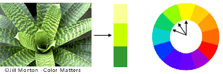
A good example of how the colour wheel can work is this colourful piece by Jon Burgerman, he demonstrates how opposite colours can work well together, for example: the green and the magenta, and then he works in other colours by using different shades of the green, going into a yellow and working his way through the steps to different shades of oranges and then the blue is opposite the orange on the colour wheel, that's how it looks bright and 'clashy' but he still manages to pull it all together to make it work.
 This poster was designed by David Carson, he uses green and blue next to each other a lot here and these colours clash and have no common ground within the colour wheel but he introduces the orange, this is opposite blue in the colour wheel — because of this, the colour 'bounce off' each other and compliment one another well. The green gradually builds up the the orange on the colour wheel from the yellow which I think it all works really well and adds 'layers' to the poster — it doesn't look flat.
Colour Experiments
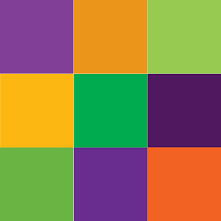 With this block of colour I experimented in illustrator with three colours (orange, green and purple) which are said to be complementary colours of each other. I tested this theory in Illustrator, although all three colours are extremely bright and prominent I think they all work well together and I can see how the colour wheel works in order to achieve really nice colour combinations! I probably wouldn't use them as block colours right next to each other but I think they'd look great broken up in an illustration or as part of a design:
purple text, green picture and orange bullet points or sub-text.

Colour Concepts
Colour can sometimes be used to indicate things so they automatically identify themselves:
Blue: Blue is often used within financial companies as it shows the brand to be trustworthy and stability. Blue is also strongly associated with the sky and the sea.


Red: Red increases your heart rate and causes you to breath more rapidly. It's grabs the attention required but isn't always a great choice in advertising as it can sometimes represent anger and hate.
Purple: Purple is often used by creative people. It portrays mystery, tranquility and mystery.
Orange: With the drama of red plus the cheer of yellow, orange is often viewed as childlike. Lighter shades appeal to an upscale market. Peach tones work well with health care, restaurants and beauty salons.
White: White connotes simplicity, cleanliness and purity. The human eye views white as a brilliant color, so it immediately catches the eye in signage. White is often used with infant and health-related products.
Colour Limitations
In design there are colour limitations for example the colour wheel shows that yellow and purple work together but those colours don't give maximum impact. I think yellow and red give a really clashing combination that gives maximum impact — but the colour wheel shows that's a no go. This demonstrates that there are limitations for designers when they want to use high impact displays/ artwork.

People who suffer from colour blindness have extreme colour limitations in everyday life which means designers have to take this into consideration when designing certain things such as a road safety poster or a colouring book in order to cater for people who can't identify certain colours. If a designer is designing for a person who suffers with deteranopia colour blindness, complimentary colours really wouldn't be relevant, for example orange and green would appear as the same shade of green:

Web designers are also limited to colours as there is a certain palette of 256 of that are safe to use on the web (except images):

http://www.colourblindawareness.org/colour-blindness/living-with-colour-vision-deficiency/
http://www.colormatters.com/red
http://www.colormatters.com/color-symbolism/the-meanings-of-colors
http://www.colormatters.com/color-and-design/basic-color-theory
http://en.wikipedia.org/wiki/Color_theory
http://www.entrepreneur.com/article/175428
Colour theory is the way in which colours work together and incorporate different elements within the theory such as: the colour wheel, color harmony, and the context of how colors are used with one another.
The first colour wheel was introduced in 1666 by Sir Isaac Newton and is made up of three primary colours red, yellow and blue. Since the first colour wheel was introduced scientists and artists have been experimenting and studied different alternatives of the wheel.
Colour is used in a number of way in different countries/ religions/ cultures, etc. In some religions/ countries white is seen as a wedding day colour — a new beginning and purity whereas in other countries people wear white for funerals and mourning and is a colour of an end of something good. In advertising this can be difficult. If you were creating a brand which was a worldwide brand you have to take into consideration every religion, every culture and every country in order to create an effective and appealing brand to all.
Each colour means something different to each person these are a few examples:
Red — Western (European & North American) people see red as all different things such as: danger, love, passion, excitement, masculinity and power whereas the Celtic believe it's a colour of death and afterlife. Eastern and Asian people see red as a bridal colour; joy and the Chinese see it as a colour as good luck and happiness. African people see red as a colour of death and Nigeria see it as a colour of wealth and aggression — two completely contrasting things. Iran see it as good fortune and Australia see red as land and Earth. All of these things are highly contrasting and it's weird how one colour could cause so much upset but for others it could bring luck and happiness.
Purple — European and North American residents associate the colour purple with royalty whereas Thailand and Brazil see it as a colour of mourning and sadness. India believe it is a colour of reincarnation. Again all of these indicate that people have completely different views on a colour.
Gold — Worldwide this colour is seen as a sign of money, success and high quality.
Pink — Personally, I find this the most interesting one as pink in European's and North American's, Asian, Indian, Japanese and Korean is seen as trust, femininity and marriage whereas in South Africa it is seen as a colour of poverty.
Colour Relationships
Relationships within colour theory often come from using different shades of a certain colour or using a colour directly opposite on the colour wheel for example:

This diagram shows how opposite colours can compliment each other and are easy on the eye as well as being significantly different and somewhat clashing.
This diagram shows how colours next to each other in the colour wheel can work well together and there can be an obvious difference in colour and shade.

A good example of how the colour wheel can work is this colourful piece by Jon Burgerman, he demonstrates how opposite colours can work well together, for example: the green and the magenta, and then he works in other colours by using different shades of the green, going into a yellow and working his way through the steps to different shades of oranges and then the blue is opposite the orange on the colour wheel, that's how it looks bright and 'clashy' but he still manages to pull it all together to make it work.

Colour Experiments

purple text, green picture and orange bullet points or sub-text.

With the block above I wanted to use opposite colours of the colour wheel and then different shades and see how they worked together. I really like how all the colours work and compliment one another! I didn't expect the green and purple to go but I think it looks really nice. I found an image of an envelope (above right) and it shows how well the colours work together — it looks clean, vibrant and modern.
Colour Concepts
Colour can sometimes be used to indicate things so they automatically identify themselves:
Blue: Blue is often used within financial companies as it shows the brand to be trustworthy and stability. Blue is also strongly associated with the sky and the sea.
Red: Red increases your heart rate and causes you to breath more rapidly. It's grabs the attention required but isn't always a great choice in advertising as it can sometimes represent anger and hate.
Green: Green is often associated with health and wealth. Darker greens are most likely to be more money and wealth where as light green offers tranquility and calmness.
Yellow: In every society, yellow is associated with the sun. It shows optimism which makes it great for displays and grabbing people's attention as it's the first colour your eyes see.


Purple: Purple is often used by creative people. It portrays mystery, tranquility and mystery.
Pink: Pink's are often used for less expensive products for women and girls or 'trendy' products —it displays youthfulness and fun.
.jpg)

.jpg)
Orange: With the drama of red plus the cheer of yellow, orange is often viewed as childlike. Lighter shades appeal to an upscale market. Peach tones work well with health care, restaurants and beauty salons.
Black: Black is serious, bold, powerful and classic. It creates drama and connotes sophistication. Black works well for expensive products, but can also make a product look heavy.


White: White connotes simplicity, cleanliness and purity. The human eye views white as a brilliant color, so it immediately catches the eye in signage. White is often used with infant and health-related products.
Colour Limitations
In design there are colour limitations for example the colour wheel shows that yellow and purple work together but those colours don't give maximum impact. I think yellow and red give a really clashing combination that gives maximum impact — but the colour wheel shows that's a no go. This demonstrates that there are limitations for designers when they want to use high impact displays/ artwork.

People who suffer from colour blindness have extreme colour limitations in everyday life which means designers have to take this into consideration when designing certain things such as a road safety poster or a colouring book in order to cater for people who can't identify certain colours. If a designer is designing for a person who suffers with deteranopia colour blindness, complimentary colours really wouldn't be relevant, for example orange and green would appear as the same shade of green:

Web designers are also limited to colours as there is a certain palette of 256 of that are safe to use on the web (except images):

http://www.colourblindawareness.org/colour-blindness/living-with-colour-vision-deficiency/
http://www.colormatters.com/red
http://www.colormatters.com/color-symbolism/the-meanings-of-colors
http://www.colormatters.com/color-and-design/basic-color-theory
http://en.wikipedia.org/wiki/Color_theory
http://www.entrepreneur.com/article/175428
Wednesday, 9 May 2012
Designers and formal elements


Tuesday, 1 May 2012
Describe the value of proofs in the design process
Describe the value of proofs in the design process
Proofing is a valuable part of the design process because it maintains relationships with the clients as you are communicating with them and asking for their opinion which will make them feel like their opinion matters and they'll keep coming back. Also, proofing is important so if there is a mistake in the design and the client has passed it off for print you (the designer) aren't to blame because it's their responsibility. Another valuable part is knowing whether the customer is satisfied with the design so you can ask for feedback on areas the client feel needs to improve.
Proofing is a valuable part of the design process because it maintains relationships with the clients as you are communicating with them and asking for their opinion which will make them feel like their opinion matters and they'll keep coming back. Also, proofing is important so if there is a mistake in the design and the client has passed it off for print you (the designer) aren't to blame because it's their responsibility. Another valuable part is knowing whether the customer is satisfied with the design so you can ask for feedback on areas the client feel needs to improve.
Explain how creative thinking techniques can be used to generate ideas in any design context
Explain how creative thinking techniques can be used to generate ideas in any design context
Mind maps - They can help by gathering all your ideas together and showing them in a simplified form and spanning off one another neatly and effectively
Discussions - They can help because ideas will bounce off each other whereas if you were to think individually your mind is more prone to be distracted and mislead off the end target
Role playing - This can help because it puts you in the situation and makes you feel more involved and take on the clients role
Scenarios - These are beneficial because it makes you think 'What would I want from this company' and makes you wonder what this company has which competitors don't
Doodling - Doodling helps because it let's your mind wander and sometimes the best things happen by mistake. It helps as a starting point until you move onto the design software
Key Features of the Design Process
Key Features of the Design Process
Brief
The first stage in the design process is getting a brief of the client which states what they want, i.e. flyer, poster, web site, etc. The brief will also include any other spec for example, colours, text, images, etc. Sometimes the customer will be open for any suggestions but the majority are specific.
Planning
The next stage of the design process would be planning the design, how long you are going to spend on each area and deciding which direction you're going to go with the design.
Research
The next stage would be researching the client, their competitors and other things which are relevant. You would research the clients colours, layouts, imagery to gain a further understanding of the company and anything which could influence the design to make it stronger and maintain the consistency of the brand. You would research the competitors so you can see what you have to contend with and make this brand more dynamic and have a 'unique selling point'.
New ideas can come from several places, for example if a web designer wanted to design something totally new and 'out there' and start a new trend he may ask original customers what they'd like to see that hasn't been done before. Also, he could check forums, attend meetings, read books and other things. Maybe the designer could create 3D webpages, it' has been done on TV and cinema so why can't it be done online and on webpages? He would have to team up with a product designer and a technology expert to figure out which direction to take but that could be the way forward to viewing webpages and the designer may have had that new idea from one comment on a forum.
Idea development
This stage is all about the starting point of the brand coming together and identifying the quality in the brand name and making it significant to the rest of the design. In this stage the initial sketches and thumbnail drawings will be done. After you have developed a few strong ideas you would then take these into design software such as Illustrator to further them and enhance them graphically.
Evaluate
At this stage you take everything you have produced and evaluate it, taking the strongest, most effective points and putting them together to create a strong, complete identity for the brand.
Decide
At this stage you decide which idea is the strongest and which corresponds well with the existing brand, and portrays a strong image and meets the clients specification.
Final Proof
The final stage is getting in contact with the client with a final proof. This is important so they can see the final result and make any changes they would like to the design.
Subscribe to:
Comments (Atom)