Colour theory is the way in which colours work together and incorporate different elements within the theory such as: the colour wheel, color harmony, and the context of how colors are used with one another.
The first colour wheel was introduced in 1666 by Sir Isaac Newton and is made up of three primary colours red, yellow and blue. Since the first colour wheel was introduced scientists and artists have been experimenting and studied different alternatives of the wheel.

Colour is used in a number of way in different countries/ religions/ cultures, etc. In some religions/ countries white is seen as a wedding day colour — a new beginning and purity whereas in other countries people wear white for funerals and mourning and is a colour of an end of something good. In advertising this can be difficult. If you were creating a brand which was a worldwide brand you have to take into consideration every religion, every culture and every country in order to create an effective and appealing brand to all.
Each colour means something different to each person these are a few examples:
Red — Western (European & North American) people see red as all different things such as: danger, love, passion, excitement, masculinity and power whereas the Celtic believe it's a colour of death and afterlife. Eastern and Asian people see red as a bridal colour; joy and the Chinese see it as a colour as good luck and happiness. African people see red as a colour of death and Nigeria see it as a colour of wealth and aggression — two completely contrasting things. Iran see it as good fortune and Australia see red as land and Earth. All of these things are highly contrasting and it's weird how one colour could cause so much upset but for others it could bring luck and happiness.
Purple — European and North American residents associate the colour purple with royalty whereas Thailand and Brazil see it as a colour of mourning and sadness. India believe it is a colour of reincarnation. Again all of these indicate that people have completely different views on a colour.
Gold — Worldwide this colour is seen as a sign of money, success and high quality.
Pink — Personally, I find this the most interesting one as pink in European's and North American's, Asian, Indian, Japanese and Korean is seen as trust, femininity and marriage whereas in South Africa it is seen as a colour of poverty.
Colour Relationships
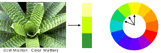
Relationships within colour theory often come from using different shades of a certain colour or using a colour directly opposite on the colour wheel for example:

This diagram shows how opposite colours can compliment each other and are easy on the eye as well as being significantly different and somewhat clashing.
This diagram shows how colours next to each other in the colour wheel can work well together and there can be an obvious difference in colour and shade.

A good example of how the colour wheel can work is this colourful piece by Jon Burgerman, he demonstrates how opposite colours can work well together, for example: the green and the magenta, and then he works in other colours by using different shades of the green, going into a yellow and working his way through the steps to different shades of oranges and then the blue is opposite the orange on the colour wheel, that's how it looks bright and 'clashy' but he still manages to pull it all together to make it work.

Colour Experiments

purple text, green picture and orange bullet points or sub-text.

With the block above I wanted to use opposite colours of the colour wheel and then different shades and see how they worked together. I really like how all the colours work and compliment one another! I didn't expect the green and purple to go but I think it looks really nice. I found an image of an envelope (above right) and it shows how well the colours work together — it looks clean, vibrant and modern.
Colour Concepts
Colour can sometimes be used to indicate things so they automatically identify themselves:
Blue: Blue is often used within financial companies as it shows the brand to be trustworthy and stability. Blue is also strongly associated with the sky and the sea.
Red: Red increases your heart rate and causes you to breath more rapidly. It's grabs the attention required but isn't always a great choice in advertising as it can sometimes represent anger and hate.
Green: Green is often associated with health and wealth. Darker greens are most likely to be more money and wealth where as light green offers tranquility and calmness.
Yellow: In every society, yellow is associated with the sun. It shows optimism which makes it great for displays and grabbing people's attention as it's the first colour your eyes see.


Purple: Purple is often used by creative people. It portrays mystery, tranquility and mystery.
Pink: Pink's are often used for less expensive products for women and girls or 'trendy' products —it displays youthfulness and fun.
.jpg)

.jpg)
Orange: With the drama of red plus the cheer of yellow, orange is often viewed as childlike. Lighter shades appeal to an upscale market. Peach tones work well with health care, restaurants and beauty salons.
Black: Black is serious, bold, powerful and classic. It creates drama and connotes sophistication. Black works well for expensive products, but can also make a product look heavy.


White: White connotes simplicity, cleanliness and purity. The human eye views white as a brilliant color, so it immediately catches the eye in signage. White is often used with infant and health-related products.
Colour Limitations
In design there are colour limitations for example the colour wheel shows that yellow and purple work together but those colours don't give maximum impact. I think yellow and red give a really clashing combination that gives maximum impact — but the colour wheel shows that's a no go. This demonstrates that there are limitations for designers when they want to use high impact displays/ artwork.

People who suffer from colour blindness have extreme colour limitations in everyday life which means designers have to take this into consideration when designing certain things such as a road safety poster or a colouring book in order to cater for people who can't identify certain colours. If a designer is designing for a person who suffers with deteranopia colour blindness, complimentary colours really wouldn't be relevant, for example orange and green would appear as the same shade of green:

Web designers are also limited to colours as there is a certain palette of 256 of that are safe to use on the web (except images):

http://www.colourblindawareness.org/colour-blindness/living-with-colour-vision-deficiency/
http://www.colormatters.com/red
http://www.colormatters.com/color-symbolism/the-meanings-of-colors
http://www.colormatters.com/color-and-design/basic-color-theory
http://en.wikipedia.org/wiki/Color_theory
http://www.entrepreneur.com/article/175428